Chase.com | Navigation Refresh
As part of an early UX/UI audit, I had identified the Ultimate Rewards navigation as a major pain point. The previous iteration was, on web, a fully exposed menu of over 15 options, with no hierarchy or clear grouping. On mobile and tablet, a hamburger menu opened to display a similar jumble.

Ultimate Rewards navigation (desktop).
Through collaboration with product partners on a refreshed taxonomy and information architecture, I was able to create a more organized pattern for the nav that took users through separate point management and redemption actions. To make the journeys clearer, we explored using descriptive, verb-lead labels in place of surfacing redemption names straight up.
After receiving signoff from senior stakeholders across product LoBs, my team conducted customer research sessions using card sort exercises to determine the optimal combination of labels and design for the uplifted nav.

Uplifted desktop view with exposed H2s.


Customer feedback has shown that while the desktop version of the navigation has been received well, users accessing the rewards experience through their phones have more trouble finding and guiding themselves through this more compact version of the nav. In an effort to ease this friction, we developed a ‘redeem-only’ version that customers have access to when entering through their account dashboard or the Chase Benefits experience. This alternate navigation elevates the most popular redemption options, but also gives users the option to see their rewards overview on the homepage.
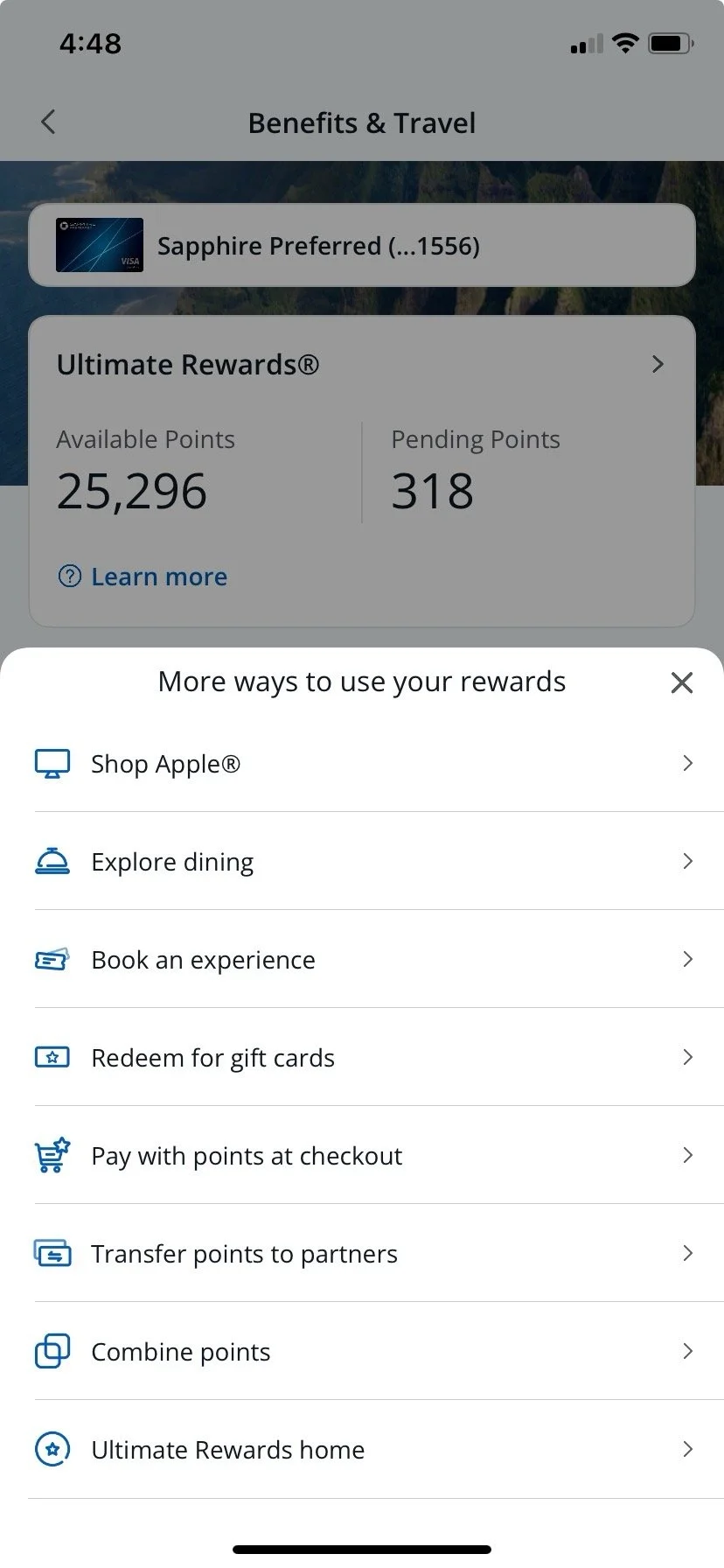
Redeem-only menu.